Period comparison
Why Period Comparison
Comparing data with a previous period is essential for understanding how your business evolves over time. You can easily compare your revenues, transactions, clicks, and other data in the charts and report tables.
How to Compare Periods
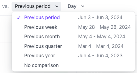
When you have the option to compare data, you can select the comparison period to the right of the period selection:

By default, the Previous period is selected, but other options are available:
- Previous period: The X previous days according to the selected time frame. For example, if you selected December 20th to December 30th, the comparison period will be December 9th to December 19th.
- Previous week: Starting on the same day of the previous week.
- Previous month: Starting on the same day of the previous month.
- Previous quarter: Starting on the same day of the previous quarter.
- Previous year: Starting on the same day of the previous year.
Comparison in Report Tables
In report tables, you get a quick overview of performance in relation to the selected comparison period thanks to colored arrows:
-
Positive Performance: When performance is positive, i.e., the data of the current period is higher than the previous period, a green arrow is displayed.

-
Negative Performance: Conversely, a negative performance is indicated by a red arrow.

-
Equal Performance: When the performance is equal, a grey arrow is displayed.

Understanding the details of the comparison data is important. When you hover your mouse over a value, a tooltip appears with vital information such as the selected period, the comparison period, their values, and the performance in percentage and absolute value.

Comparison in Charts
You can compare data evolution in charts, such as income, as shown in this example on the income page of the dashboard:

The chart displays the evolution of income in blue for the selected period and in grey for the compared period. At the top of the chart, you can see the total of the two periods.
When you move your mouse over the chart, you can see detailed data and their performance:
